MoMA Membership Page
User Experience Design Project, 2020

The MoMA Membership Page needs a redesign.
Memberships are one of the most important sources of income for museums. Therefore, being able to provide digital convenience for users shopping for a membership plan should be the top priority. However, the current MoMA Membership page has a few problems that might make the shopping experience not so enjoyable. In this project, I identified user pain points through research and interviews, imagined the ideal user experience through developing user narratives, and prototyped an improved website redesign.
Interact with my prototype on Figma
Duration: 3 weeks
Solo project
Problem Overview
& current user journey
Vague Description
Pricing plans have vague and similar descriptions that will cause a lot of confusion for users.
Inconvenient Comparison
Information is too spread out. Users are required to have multiple tabs open in order to compares the perks for different pricing plans.
Poor Information Hierarchy
Plans with more perks and higher pricing are not emphasized/advertised well.
Audience & Research
Interviews
Online Research
Nancy (age 66)
Looking to gift memberships; paying close attention to tax deductibles
Li (age 49)
Buying membership for family and kids; looking for the best value
Sam (26)
Has never owned a membership before; want experience but on a budget
74% of online purchases are made on desktop
80% of consumers see experience as equal importance as product and services
22% of museum-goers have a membership in 2017, and it has been decreasing
Persona


User Narratives
Emphasis on Patron Programs
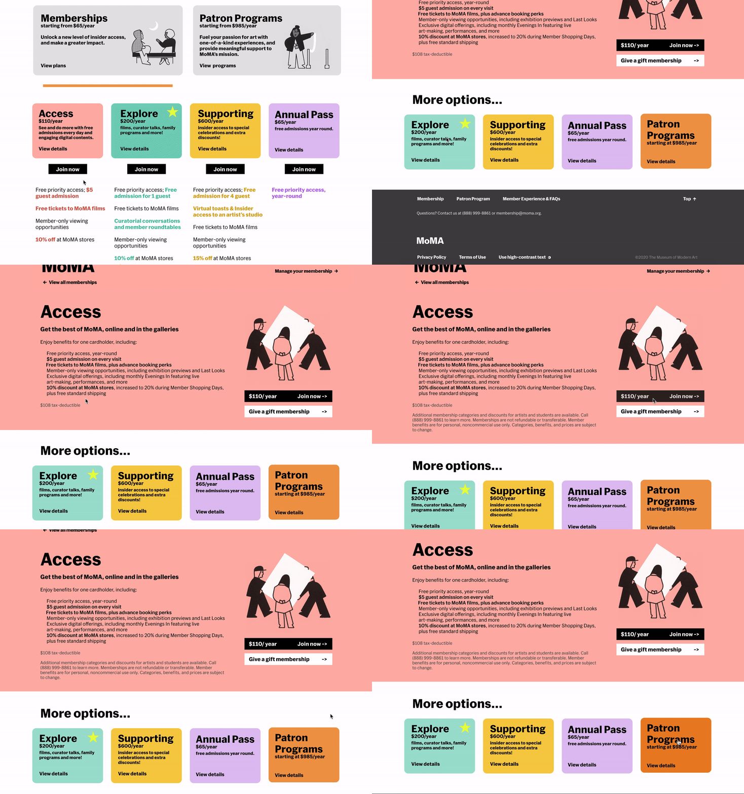
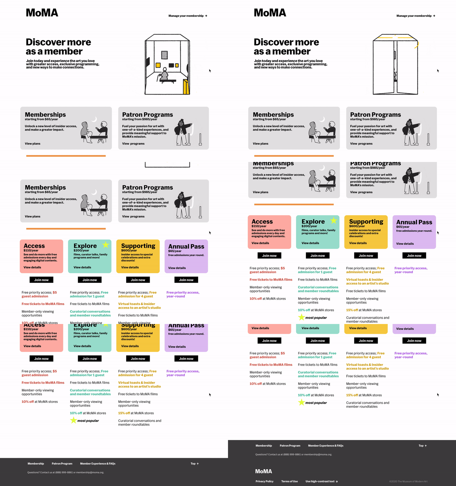
instead of being placed at the bottom, Patron programs are now on the same level as membership plans.
Star Indicator
The most popular plan will be marked with an indicator to help indecisive first-time users to pick their plan.

Individual Plans
More concise descriptions
repetitive descriptions are removed, and extra information on tax deductibles are hidden.
Multiple Suggestions
instead of suggesting only one plan, all the plans(including a tab to patron programs) are listed below, in case the user wants to explore more options.

Conclusion
What does the redesign
accomplish?

More organized and simplified information
Easy comparison between pricing options + more guiding features to aid decision-making
Emphasis on certain pricing plans to help generate more revenue


